以下的 CSS 代码,给按钮添加了一些效果
1
2
3
4
5
6
7
8
9
| padding: 6px 16px;
border: 1px solid #446d88;
background: #58a linear-gradient(#77a0bb, #58a);
border-radius: 4px;
box-shadow: 0 1px 5px gray;
color: white;
text-shadow: 0 -1px 1px #335166;
font-size: 20px;
line-height: 30px;
|
这段代码在可维护性方面存在一些问题。
如果决定改变字号,就得同时调整行高,因为这两个属性都写成了绝对值。行高并没有反映它跟字号的关系,因此我们还得做些算术,算出字号改变之后的行高应该是多少。
当某些值相互依赖时,应该把他们的相互关系用代码表示出来。
1
2
| font-size: 20px;
line-height: 1.5;
|
同样,字号也不应是绝对长度值。因为如果把父级的字号加大,就不得不修改每一处使用绝对值作为字体尺寸的样式。如果改用百分比或 em 单位就好多了
1
2
| font-size: 125%;
line-height: 1.5;
|
接着需要使间距伴随着字号大小改变。
1
2
3
4
5
6
7
8
9
| padding: .3em .8em;
border: 1px solid #446d88;
background: #58a linear-gradient(#77a0bb, #58a);
border-radius: .2em;
box-shadow: 0 .05em .25em gray;
color: white;
text-shadow: 0 -.05em .05em #335166;
font-size: 125%;
line-height: 1.5;
|
此时需要重新审视到底哪些效果应该跟着按钮一起放大,而哪些效果是保持不变的。
阴影颜色伴随主色调
1
2
3
4
5
6
7
8
9
| padding: .3em .8em;
border: 1px solid rgba(0,0,0,.1);
background: #58a linear-gradient(hsla(0,0%,100%,.2), transparent);
border-radius: .2em;
box-shadow: 0 .05em .25em rgba(0,0,0,.5);
color: white;
text-shadow: 0 -.05em .05em rgba(0,0,0,.5);
font-size: 125%;
line-height: 1.5;
|
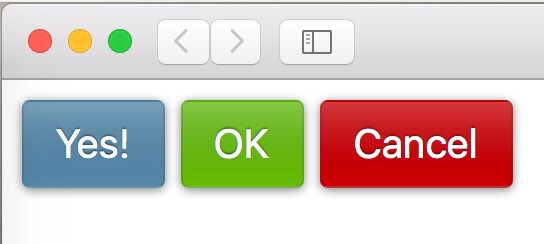
现在我们只要覆盖 background-color 属性,就可以得到不同颜色版本的按钮了
1
2
3
4
5
6
7
| button.cancel {
background-color: #c00;
}
button.ok {
background-color: #6b0;
}
|
1
2
3
4
5
6
7
8
9
10
11
12
13
14
15
16
17
18
19
20
21
22
23
24
25
26
27
28
29
30
31
32
| <!DOCTYPE html>
<html lang="zh-CN">
<head>
<meta charset="utf-8">
<style>
button {
padding: .3em .8em;
border: 1px solid rgba(0,0,0,.1);
background: #58a linear-gradient(hsla(0,0%,100%,.2), transparent);
border-radius: .2em;
box-shadow: 0 .05em .25em rgba(0,0,0,.5);
color: white;
text-shadow: 0 -.05em .05em rgba(0,0,0,.5);
font-size: 125%;
line-height: 1.5;
}
button.cancel {
    background-color: #c00;
}

button.ok {
    background-color: #6b0;
}
</style>
</head>
<body>
<button>Yes!</button>
<button class="ok">OK</button>
<button class="cancel">Cancel</button>
</body>
</html>
|
参考书籍:《CSS揭秘》